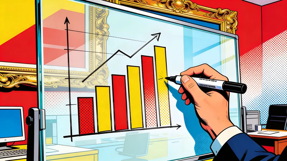
Ask Claude about compound interest now and you get a chart. An interactive one, built from HTML and SVG, rendered directly inside the conversation. Click the axes and adjust the variables. Watch the curve bend.
Ask ChatGPT the same thing and it hands you a colorful illustration. Image model output, essentially. Pretty. Static. Pinch to zoom, sure. But the data underneath? Sealed shut.
That distinction matters more than either company will admit. On Thursday, Anthropic rolled out inline visualizations for all Claude users, including those on the free tier. The feature builds charts, diagrams, and interactive widgets directly inside the chat window, no side panel, no separate artifact. Claude decides when a visual would help, or you ask for one. It generates HTML and SVG on the fly, renders it inline, and the whole thing evolves as the conversation moves forward.
Anthropic calls it giving Claude a whiteboard. The metaphor is precise. A whiteboard is functional, collaborative, temporary. You sketch on it during a meeting, erase it, sketch again. Same principle here. The visuals show up mid-conversation, do what they need to, and get wiped when the topic changes.
A canvas is different. A canvas is for making things you frame and hang on a wall.
The Breakdown
- Anthropic launched free inline visualizations for all Claude users, building HTML/SVG charts directly inside conversations.
- Three AI labs shipped interactive visuals in one week, each targeting different users: students, premium subscribers, or enterprise workers.
- Anthropic's enterprise market share jumped 61% in one year. Inline visuals extend its workplace-first strategy.
- Claude now decides when to show a chart, making response format part of the model's editorial judgment.
The race that almost doesn't matter
Three companies shipped interactive visuals in the same week. OpenAI launched "dynamic visual explanations" on Tuesday, focused on math and science. Google debuted interactive charts for Gemini last December, but locked them behind Gemini Ultra at $200 a month. Anthropic launched Thursday, beta, all plan types, zero paywall.
The speed here is instructive but not the real story. What matters is the divergence in strategy underneath these similar-sounding announcements.
OpenAI's version targets students. Google's targets premium subscribers willing to pay more per month than most people spend on streaming. Anthropic's targets everyone, with a clear eye on the person who actually needs a diagram during a work conversation, not the person browsing for fun.
And Anthropic needs a win right now. Data from early February showed OpenAI's consumer lead contracting as Claude and other competitors gained ground. The company is simultaneously fighting a Pentagon supply chain designation that threatens hundreds of millions in government contracts. Emboldened by its growing consumer base but anxious about the defense revenue cliff, Anthropic is making moves that prioritize breadth over exclusivity. Free visuals for everyone is that play.
The whiteboard matters more than the paintbrush
Here is the bet Anthropic is making. In a market drunk on image generation, where OpenAI's GPT-4o image tools went viral generating Studio Ghibli portraits and Google's Nano Banana became a meme, Anthropic decided that programmatic visuals matter more than generative art.
Think about what that means for you if you run a team. Image generation gives you a poster for the breakroom. A whiteboard gives you a diagram of the quarterly pipeline that updates when someone asks a follow-up question.
Claude's inline visuals are built from code, not pixels. HTML and SVG, rendered live, clickable, adjustable. CNET's Blake Stimac asked Claude to show him how to change a tire and got an interactive seven-step illustration built from scratch. The New Stack's Frederic Lardinois had Claude draw an airport traffic pattern, and while it mostly got the layout right, it aligned one arrow with the wrong part of the field. The errors are instructive. This is a beta, and programmatic visuals can be wrong in ways that are easier to spot and fix than a hallucinated image.
That distinction is the whole argument. A generated image that looks correct but contains fabricated data is worse than a chart that misplaces a label. You can fix the label. You cannot interrogate a JPEG.
Stay ahead of the curve
Strategic AI news from San Francisco. No hype, no "AI will change everything" throat clearing. Just what moved, who won, and why it matters. Daily at 6am PST.
No spam. Unsubscribe anytime.
Engadget's Igor Bonifacic noted Anthropic was quick to clarify that this is not image generation. The company is drawing a deliberate line. And that line tells you something about where Anthropic thinks its paying customers actually are.
Enterprise is the scoreboard
The consumer AI wars make great headlines. Nano Banana memes, Ghibli portraits, viral TikToks of AI-generated cats. None of that is where the money concentrates.
Enterprise AI spending hit $13.8 billion in 2025 and is projected to double this year, according to IDC estimates. The companies writing those checks do not need their AI assistant to paint. They need it to explain a database schema to a new hire. Show a sales lead how revenue compounds with a second product line. Diagram a migration architecture before anyone commits budget.
Anthropic went from 18% to 29% of the enterprise AI assistant market in a single year. A 61% jump. That growth came from Claude Code, Claude's artifacts system, and its reputation for reliable reasoning. The inline visuals feature extends that logic. A workplace tool first, one that happens to ship on the free tier because distribution matters more than paywall revenue at this stage.
Inc.'s Ben Sherry tested the feature by asking Claude for a visual timeline of a news controversy and got an interactive display complete with an "outrage level" meter. That is cute. But the real use case is the analyst who asks Claude to visualize a dataset they just pasted in, gets an interactive chart, adjusts the parameters through conversation, and exports the result. No Tableau license. No switching tabs. No formatting a spreadsheet into something presentable.
Here is the workflow that dies. Picture the analyst who just got quarterly numbers. Into the spreadsheet they go. Twenty minutes of fighting with Excel later, there is a PNG sitting in Slack or on a slide that nobody will ever update. That chart dies the second it leaves the spreadsheet. If someone in the meeting asks "what happens if we adjust the growth rate," the analyst opens the file again, changes the number, re-exports, re-pastes. Claude collapses that entire loop into conversation. Paste the numbers, ask for a chart, get one. Ask for a different axis, get another. The visual lives inside the discussion where the thinking actually happens.
That workflow is a direct shot at the lightweight end of the business intelligence market. Tableau and Power BI are not going away. But the quick-and-dirty charts that people build just to explain something in a meeting? Those belong to Claude now. And Google knows it. Mountain View looked cautious launching its own version behind the $200 Gemini Ultra paywall, a pricing decision that reads less like confidence and more like hedging against cannibalization of its own Workspace charting tools.
What gets lost when everything becomes visual
There is a risk here that nobody is talking about. When AI assistants start deciding on their own when to generate a visual, the response format becomes part of the model's opinion. Claude now chooses whether to give you text or a chart. That is a design decision baked into a language model's inference loop.
Say you ask Claude about your company's server uptime and it decides a chart would help. The chart shows a trend line. That trend line is Claude's interpretation, filtered through whatever the model decided looks right. Maybe it smooths a dip that matters. Maybe it picks a y-axis scale that flattens a spike you should have noticed. The raw numbers would have told you more. Now there is an editorial layer sitting between you and the data, and you never asked for one. Nobody asked for editorial. You asked for a chart.
This is different from the image generation problem, where the risk is fabrication. Here the risk is emphasis. A chart that is technically accurate but visually misleading can be harder to catch than one that is obviously wrong. And unlike a generated image, which most people evaluate with some skepticism, an interactive chart carries the authority of data. People trust charts. They do not trust pictures the same way.
The New Stack flagged a practical problem. Generating these visuals takes time, sometimes 30 seconds. Users who expect instant answers may find themselves waiting for a diagram they did not need. And since the feature is on by default, Claude will sometimes build a chart when a sentence would have done the job.
But whiteboards have a failure mode. They only work when someone grabs the marker at the right moment, and knows when to put it down. A model that reaches for the marker too often will annoy the people who came for a quick answer. Anthropic says users can ask for adjustments or request a different format. But the default matters enormously. Most users never change defaults. They live with whatever the system gives them.
Google charges $200 a month for its version, a price that filters out casual users by design. OpenAI kept the scope narrow, math and science only. Anthropic went the other direction entirely, free and unrestricted, which means it will face the widest range of use cases and the loudest complaints when visuals show up where they should not.
Where the whiteboard leads
Anthropic is building a pattern. Artifacts for persistent documents. Interactive apps via MCP for Figma, Slack, Canva, and nine other tools launched in January. Now inline visuals for ephemeral understanding. Each addition makes Claude less of a chatbot and more of a workspace.
That trajectory points somewhere specific. The AI assistant as the primary interface, with individual applications serving as data sources and action endpoints rather than standalone experiences. You talk to Claude. Claude talks to your tools. The visuals are the connective tissue, the quick sketch that makes the conversation productive before you commit anything to a permanent format.
Anthropic is not the only company heading in that direction. But it may be the only one doing it without a $200 paywall or a narrow subject restriction. The whiteboard is open. Whether that generosity is strategic brilliance or a sign that Anthropic cannot afford to charge for it yet is a question worth sitting with.
The answer probably depends on which side of the Pentagon lawsuit you are watching from.
Frequently Asked Questions
How do Claude's inline visuals differ from artifacts?
Artifacts are persistent documents in a side panel, designed to be shared or downloaded. Inline visuals are temporary, appearing directly in the chat and changing or disappearing as the conversation evolves. Think of artifacts as finished documents and inline visuals as whiteboard sketches during a meeting.
What technology does Claude use to generate visuals?
Claude generates HTML and SVG on the fly, not pixel-based images from a diffusion model. Anthropic explicitly distinguishes this from AI image generation. The visuals are interactive and clickable because they are built from code, not rendered from a neural network trained on photographs.
Is the inline visuals feature available on mobile?
Not yet. Anthropic launched inline visuals for web and desktop only, with no announced timeline for mobile. The feature is in beta across all plan types, including the free tier, with Anthropic warning users to expect quirks as it matures.
How does Anthropic's pricing compare to Google's similar feature?
Anthropic offers inline visuals free on all plans. Google launched interactive charts for Gemini Ultra subscribers at $200 per month last December. OpenAI's dynamic visual explanations, launched days earlier, are limited to math and science but available on standard plans.
Can Claude's visualizations contain errors?
Yes. The New Stack tested the feature and found Claude misaligned an arrow in an airport traffic pattern diagram. The upside of code-based visuals is that errors like a misplaced label are easier to spot and correct than fabricated data in a photorealistic image.


Marcus Schuler
Editor-in-Chief and founder of Implicator.ai. Former ARD correspondent and senior broadcast journalist with 10+ years covering tech. Writes daily briefings on policy and market developments. Based in San Francisco. E-mail: editor@implicator.ai